There’s something almost magical about a peacock in full display the way its tail unfurls into a shimmering wall of blue and green, each feather stamped with that unmistakable “eye” pattern.
It’s no wonder peacocks are one of the most requested subjects among artists, from beginners doodling in a sketchbook to illustrators building out a detailed portfolio piece.
The good news is that drawing a peacock is far more approachable than it looks. Once you understand the underlying shapes the curved neck, the fan-like tail structure, the repeating eye-spot motif the rest becomes a matter of patient layering rather than raw talent.
This guide walks through the entire process: understanding peacock anatomy, choosing your materials, building the drawing step by step, inking, coloring for that signature iridescent shimmer, and avoiding the common mistakes that trip up even experienced artists.
By the end, you’ll have a complete peacock drawing and the skills to draw another one, in a different pose, with confidence.
Understanding Peacock Anatomy Before You Draw
Before picking up a pencil, it helps to actually understand what you’re drawing peacocks have a distinct set of proportions and features that separate a convincing drawing from one that just “looks off.”
Body proportions: A peacock’s body is relatively compact and oval-shaped compared to its dramatic tail. The head is small, roughly a third the size of the body, and sits atop a long, graceful neck that curves in an S-shape.
Head and crest: Both males and females have a crest a cluster of five to six thin feathers, each topped with a tiny fan-shaped tuft, forming a crown-like silhouette above the head.
Neck curvature: The neck’s curve does a lot of storytelling. A tighter curve suggests alertness or display posture; a looser, elongated curve suggests calm or walking motion.
Wings and legs: The wings are often tucked and barely visible, especially in classic front-facing poses where the tail dominates. The legs are thin, with three forward-facing toes and one back toe functional rather than decorative, so they don’t need heavy detail.
Male vs. female: The dramatic, eye-spotted train belongs to the peacock (male). Peahens (females) are notably plainer, with brown and grey feathers and no extended tail worth knowing if accuracy matters to your piece.
Materials and Tools
The right tools won’t make or break your drawing, but they can make the process smoother and each medium brings a slightly different feel to the finished piece.
Traditional tools:
- Pencils: An HB pencil works well for initial light sketching, while a 2B is useful for darker guide lines and shading. Mechanical pencils give more consistent line weight for fine feather details.
- Erasers: A standard eraser handles broad corrections, but a kneaded eraser is ideal for lifting pencil lines gently without smudging especially useful around delicate feather barbs.
- Fine-liners or ink pens: For a clean, finished look, fine-liners in a couple of nib sizes (like 0.1mm and 0.3mm) let you vary line weight between the body and the fine feather strands.
- Paper: A smooth to lightly-textured paper (around 90–140 lb) holds detail well without catching your pen tip, which matters when inking fine lines.
Digital tools:
- A tablet and stylus (with pressure sensitivity) make it much easier to vary line weight naturally, especially for feather texture.
- Look for brushes designed for fine linework or texture a basic round brush for sketching, and a textured or “hair/fur” style brush for feather barbs, work well together.
- Digital also has the advantage of non-destructive layers, so you can sketch, ink, and color on separate layers without committing too early.
Coloring mediums:
- Colored pencils: Great for soft blending and iridescent gradients, though slower to build up rich color.
- Watercolor: Excellent for a loose, glowing effect that suits the shimmering quality of peacock feathers, but less forgiving for tight detail.
- Markers: Fast and vibrant, good for bold, saturated color, though blending subtle iridescence takes more practice.
- Digital painting: Offers the most flexibility — easy blending, unlimited undo, and layer effects (like glow or overlay) that can mimic iridescence convincingly.
Choosing a Pose or Composition
Before you start sketching in earnest, it’s worth deciding what kind of peacock you actually want to draw the pose you choose shapes everything from difficulty level to how much time you’ll spend on the tail.
Front-facing display pose: This is the classic, most recognizable peacock image body facing forward, tail fully fanned out symmetrically behind it. It’s visually striking but also the most demanding, since you’re drawing dozens of feathers and eye-spots in a radiating pattern that needs to stay balanced on both sides.
Side profile: A peacock standing or walking in profile is a great option for beginners. The tail can trail along the ground or be partially closed, which means less symmetry to manage and fewer feathers to render in full detail.
Head-and-neck-only portrait: If the full tail feels intimidating, focus in tight on just the head, crest, and upper neck. This lets you practice the trickier small details the eye, beak, and crest feathers — without tackling the tail at all.
Mid-motion or dynamic pose: A peacock caught mid-step, or with the tail partially raised, adds energy and a sense of life to the piece, though it requires a stronger grasp of anatomy since you’re deviating from the “safe” symmetrical poses.
Thumbnail sketching first: Whatever pose you choose, it’s worth spending two or three minutes on small, rough thumbnail sketches before committing to a full-size drawing. This lets you test proportions, balance, and composition cheaply it’s much easier to fix a lopsided layout at thumbnail size than after an hour of detailed feather work.
Step-by-Step Drawing Process
With your pose chosen and materials ready, it’s time to actually build the drawing. Work in layers loose shapes first, detail last and resist the urge to render feathers before the underlying structure is solid.
5.1 Blocking in Basic Shapes
Start with light, loose pencil strokes you won’t mind erasing later.
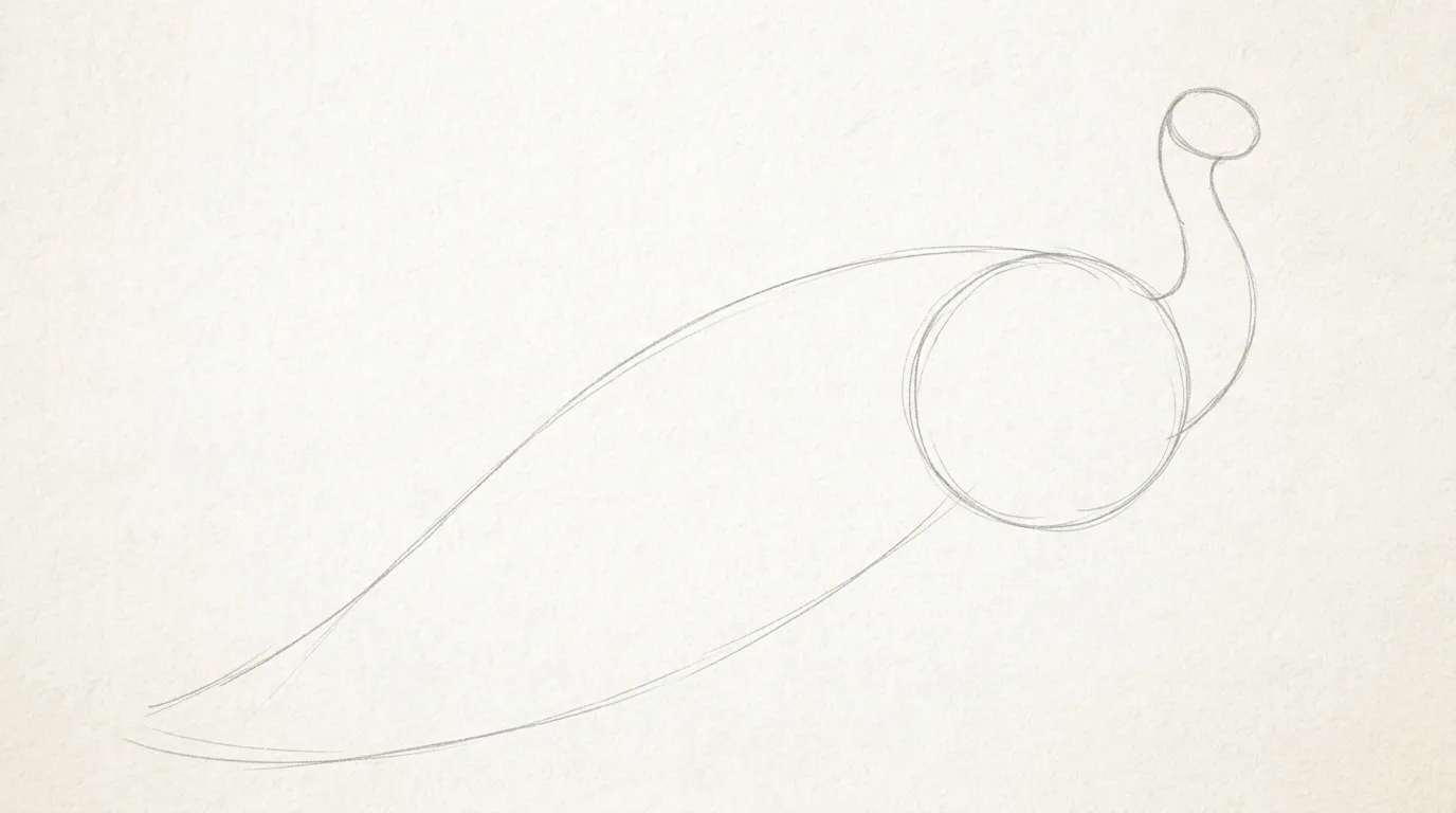
- Draw an oval for the body, angled to match your chosen pose.
- Add a smaller circle for the head, positioned above and to one side.
- Connect the two with a gentle S-curve for the neck.
- Sketch a broad triangle or fan wedge behind the body to reserve space for the tail you’ll build the actual feathers into this later.
5.2 Structuring the Head, Beak, Crest, and Eye
- Refine the head circle into a slightly more elongated, teardrop-like shape.
- Add a small, pointed beak at the front.
- Sketch the crest as five or six thin lines rising from the top of the head, each capped with a tiny fan-shaped tuft.
- Place the eye about a third of the way down the head, drawn as a simple oval with a small highlight dot to add life.
5.3 Drawing the Neck and Chest Curve
- Widen the neck gradually as it flows into the chest, avoiding a straight or uniform width the natural taper is what makes it read as convincing rather than stiff.
- Let the chest curve outward slightly before meeting the body oval, echoing the rounded, puffed appearance of a peacock’s front.
5.4 Adding Legs and Feet
- Draw two thin legs beneath the body, slightly bent at the knee joint if the pose is mid-stride.
- Keep the feet simple: three forward-facing toes and one shorter back toe per foot, without over-detailing the eye naturally skips past this area toward the tail.
5.5 Constructing the Tail Fan Framework
- From the base of your reserved tail wedge, draw long, gently curving guide lines radiating outward like ribs in a fan.
- Vary the length and spacing slightly rather than making every line identical real peacock tails have subtle asymmetry that keeps them from looking mechanical.
- If drawing a full front-facing display, keep the overall fan roughly symmetrical left-to-right even as individual feathers vary.
5.6 Drawing Individual Feathers and Eye-Spot Patterns
- At the end of each guide line, draw the signature eye-spot: essentially three nested ovals (a target shape) a dark outer ring, a lighter inner ring, and a small central spot.
- Angle each eye-spot slightly to follow the curve of its guide line rather than drawing them all perfectly upright.
- This is the most recognizable feature of the drawing, so it’s worth practicing the eye-spot shape separately a few times before placing it across the full fan.
5.7 Layering Feather Barbs and Texture
- Along each guide line, add short, thin diagonal strokes branching off to either side these represent the fine barbs that give feathers their soft, textured edge.
- Concentrate the heaviest texture on the front-most feathers, letting feathers toward the back of the fan fade into simpler, less detailed lines. This creates natural depth and stops the piece from feeling flat.
5.8 Refining and Cleaning Up Sketch Lines
- Once the full structure is in place, go back over your favorite lines with slightly firmer pencil pressure to establish your final linework.
- Erase any stray guide lines, overlapping construction marks, or duplicate strokes.
- Step back and check overall balance proportions, symmetry, and spacing before moving on to inking.
Inking and Line Work
Once your pencil sketch feels solid, inking is what locks in the final linework but it’s worth approaching it deliberately rather than just tracing over every pencil line at the same weight.
Choosing line weight for depth: Use thicker, more confident lines for the body, head, and the base of the tail feathers, where the peacock is closest to the “camera” and structurally solid. As lines travel outward toward the feather tips and fine barbs, taper them thinner. This variation alone does a lot of work in making the drawing feel three-dimensional rather than flat.
Tools for clean inking: A fine-liner with at least two nib sizes (something like 0.1mm for delicate barbs and 0.3–0.5mm for body outlines and eye-spot rings) gives you the range you need. If working digitally, a pressure-sensitive brush set to vary width automatically saves time, though manually adjusting brush size for different areas still gives more control.
Working order: Ink the main body and head first, then the tail guide lines, then the eye-spots, and finish with the fine feather barbs last. This order keeps your hand moving away from areas you’ve already inked, reducing the risk of smudging.
Fixing mistakes without starting over: A shaky or misplaced ink line doesn’t mean scrapping the piece.
- On paper, a thin strip of white paint or a correction pen can cover small errors, or you can simply incorporate a stray line into an additional feather barb.
- Digitally, this is even easier just erase or undo, since ink typically sits on its own layer above the pencil sketch.
- If a whole feather looks off, it’s often faster to redraw just that feather than to redo the entire tail.
Once inking is complete and fully dry (or the ink layer is finalized digitally), erase all remaining pencil guide lines so only the clean ink linework remains this is your base for coloring.
Coloring and Shading Techniques
This is where the peacock really comes to life the color palette and shading are what create that signature shimmering, iridescent effect.
Realistic iridescent color palette: Peacocks are known for deep blues, teals, and emerald greens, often shifting into gold or bronze near the base of the tail feathers. Rather than using flat, single colors, build each area from two or three related shades for example, a deep navy blue blended into teal on the neck and chest.
How iridescence works (and how to fake it): True iridescence comes from light refracting off microscopic feather structures, which obviously can’t be replicated literally on paper. The visual trick is layering: apply a base color, then add a second, shifted hue (like teal over blue, or green over teal) along the edges and curves where light would naturally catch. This color-shifting, rather than a single flat tone, is what reads as “shimmering” to the eye.
Shading for volume: Decide on a single light source direction before you start shading this keeps the whole piece consistent. Add deeper shadow tones on the underside of the neck curve, beneath the chest, and where feathers overlap in the tail. Shadows help separate individual feathers from one another rather than letting the fan read as one flat shape.
Highlighting for shimmer: Once base colors and shadows are in place, add small highlights of light teal, turquoise, or even a touch of white along the top edges of curves the crest, the neck, and the upper rims of the eye-spots. These small, deliberate highlights do most of the work in selling the iridescent effect.
Coloring the eye-spots specifically: Each eye-spot typically reads well with a dark blue-black outer ring, a bright teal or green middle ring, and a warm gold or bronze center this contrast is part of what makes the pattern so eye-catching.
Stylized or flat-color alternatives: If you’re going for a more decorative or graphic style rather than realism, flat, saturated color blocks (without gradients or heavy shading) can work beautifully too this approach suits mandala-style or vector-illustration peacocks particularly well, and is significantly faster to execute.
Common Mistakes and How to Fix Them
Even with a solid process, a few recurring issues tend to trip up peacock drawings specifically. Here’s what to watch for.
Overcrowding the tail with too many feathers: It’s tempting to pack in as many feathers as possible for a “fuller” look, but this often backfires the eye can’t rest anywhere, and the drawing starts to feel chaotic rather than elegant. Fix: Aim for 10–15 well-detailed feathers rather than 30 rushed ones. Vary their length and let some overlap naturally rather than spacing them all evenly.
Flat, lifeless eye-spots: A single flat-colored oval doesn’t read as the shimmering “eye” pattern peacocks are known for. Fix: Always build the eye-spot from at least three nested tones (dark outer ring, bright middle ring, warm center), and angle each spot slightly along its feather’s curve rather than drawing them all perfectly upright and identical.
Disproportionate neck and head size: A common error is drawing the head too large relative to the body, which makes the peacock look cartoonish even when that wasn’t the intent. Fix: Keep the head roughly a third the size of the body oval, and double-check this ratio at the sketch stage before inking since it’s much easier to resize a pencil line than an inked one.
Stiff, unnatural feather curves: Feathers drawn as straight lines or perfectly uniform arcs tend to look rigid and artificial. Fix: Introduce slight variation into each guide line’s curve, and avoid mirroring the exact same shape across every feather natural asymmetry, even subtle, sells realism.
Losing symmetry balance in the fan: Ironically, while individual feathers should vary, the overall fan shape can look lopsided if one side has noticeably more volume or reaches further than the other. Fix: Periodically step back (or flip the canvas horizontally if working digitally) to check that the left and right halves feel balanced in mass, even if they’re not identical.
Style Variations
Once you’re comfortable with the core process, it’s worth experimenting with different stylistic approaches the same anatomical foundation can produce very different final results.
Realistic/detailed illustration: This approach leans into everything covered so far accurate proportions, layered iridescent coloring, dense feather texture, and careful shading for volume. It’s the most time-intensive style but produces the most striking, lifelike results, well-suited to portfolio pieces or wildlife art.
Simplified cartoon/flat-vector style: Here, the peacock is reduced to clean, bold shapes with minimal internal detail a simplified tail fan, flat color fills, and often exaggerated proportions (like an oversized head or crest) for charm and readability. This style works well for logos, character design, or children’s illustration, and is significantly faster to produce.
Line-art/mandala-inspired designs: Rather than aiming for realism, this treats the peacock’s tail as a decorative, symmetrical pattern often incorporating mandala-style repeating shapes within each feather instead of naturalistic eye-spots. It’s popular in tattoo design, coloring books, and pattern-based illustration, and prioritizes rhythm and balance over anatomical accuracy.
Watercolor loose style: This approach embraces looseness rather than fighting it letting colors bleed and blend naturally to suggest the shimmer of feathers rather than rendering each one with hard edges. Feather details are often implied with a few confident brushstrokes rather than fully outlined, giving the piece a soft, atmospheric quality.
Digital painting approach: Rather than relying on clean linework, this style builds form primarily through color and light using soft, blended brushes closer to painting than drawing. Layer effects (like glow, overlay, or screen blending modes) can be used deliberately to simulate the iridescent shimmer, something that’s harder to achieve convincingly with traditional media.
Trying more than one of these styles with the same reference pose is a great way to understand which parts of the peacock’s design are essential to “read” as a peacock, versus which parts are flexible depending on the artistic approach.
Practice Exercises
Building confidence with peacocks especially the trickier elements like eye-spots and feather fans comes from breaking the drawing down into smaller, repeatable exercises rather than only attempting full pieces.
Isolated eye-spot practice sheet: Dedicate a full page to drawing nothing but eye-spots the same nested-oval “target” shape, repeated 15–20 times at different sizes and angles. This is the single most useful drill for peacock drawing, since the eye-spot is the most recognizable (and most frequently botched) element of the whole piece.
Single feather studies: Draw individual feathers in isolation, from base to tip, focusing on the curve, the barb texture, and how the eye-spot integrates naturally into the feather’s shape. Try a few at different lengths and angles to build a small mental library you can pull from later.
Gesture sketching for pose and movement: Set a short timer (30–60 seconds per sketch) and draw quick, loose peacock gestures just the flow of the neck, body, and general tail mass, with no detail. This builds intuition for proportion and posture that carries over into more finished work, and helps avoid the “stiff” look covered earlier.
Speed sketches vs. detailed studies: Alternate between fast, five-minute sketches focused purely on getting the overall shape right, and slower, more deliberate studies where you push full detail into just one section (like the head, or a small cluster of tail feathers). Both skills matter speed builds confidence with proportion, while detailed studies build technical control.
Working through these exercises even briefly before a full piece five or ten minutes of eye-spot or gesture practice tends to noticeably improve the final drawing, since the trickiest parts feel familiar rather than being solved for the first time mid-piece.
Bonus Tips from Experienced Artists
A few smaller, less obvious habits tend to separate polished peacock drawings from ones that just look “pretty good” these are the kinds of tips that usually only come from repetition.
Using reference photos effectively: Rather than copying a single photo directly, pull from two or three references one for overall pose, one for feather pattern detail, one for color. This avoids the stiffness that comes from mechanically copying one image, while still keeping the anatomy and coloring grounded in something real rather than guessed. Zooming into reference photos to study just the eye-spot pattern up close is particularly useful, since it’s easy to oversimplify from memory.
Building a personal feather-pattern “library”: Once you’ve drawn a feather or eye-spot you’re happy with, keep it whether as a physical practice sheet or a saved digital file. Over time, this becomes a reusable reference you can pull from instead of re-solving the same shape from scratch on every new piece, which speeds up future work considerably.
Scaling detail based on the focal point: Not every part of the drawing needs equal attention. Decide early where you want the viewer’s eye to land usually the head or the front-most feathers and push your most detailed rendering there, while letting peripheral feathers and background elements stay looser and simpler. This selective detail is often what makes a piece feel intentional rather than uniformly “busy.”
Working at a slight remove: Step away from the piece periodically even just standing up and looking at it from a few feet back, or zooming out on a digital canvas to catch proportion or balance issues that are hard to spot up close. This habit alone catches a surprising number of the common mistakes covered earlier.
Conclusion:
Drawing a peacock is ultimately a lesson in patience and layering simple shapes evolve into structure, structure into feathers, and feathers into the shimmering detail that makes the final piece feel alive.
None of it requires natural talent so much as a willingness to slow down at each stage, especially around the eye-spot pattern and tail symmetry that trip up even experienced artists.
The version you’ve drawn following this guide is really just a starting point. Try the same process with a different pose a walking profile instead of a full display, or a tight head-and-neck portrait and notice how much faster the anatomy comes together the second time.
Experiment with the style variations too; a loose watercolor peacock and a clean vector one will teach you different things about what actually makes the design recognizable.
If you worked through this tutorial, I’d love to see how it turned out feel free to share your drawing in the comments, or tag it if you’re posting online.
And if you’re looking for a next challenge, a companion tutorial on drawing peahens or other ornate birds (like pheasants or birds of paradise) would be a natural next step for building on these same feather-and-pattern skills.

I am Ethan Carter, a young writer sharing creative ideas and inspiring thoughts on Smartsimiles.com.
I am passionate about spreading knowledge, positivity, and smart smiles through my words.